


Visualizing Big-Play Running Backs From the 2015 NFL Season


No one statistic is going to tell you the whole story.
That's even truer when it comes to a running back's yards per carry average. Especially if you're looking at a low-volume player, one or two big runs can completely skew that single average -- that rate -- and tell a dramatically different narrative.
The thing is, though, at numberFire, we don't simply look at box scores to try and evaluate player performance through numbers. We use our own Net Expected Points (NEP) metric, which attempts to measure how many points a player adds for his team versus expectation. You can read more about NEP in our glossary.
Yards per carry generally will correlate with our Rushing NEP per rush metric. With yards per carry, you're looking at how many yards a running back accumulates per rush. With Rushing NEP per rush, you're doing the same, except replace "yards" with "points".
But like I said -- looking strictly at that one statistic doesn't tell you everything. When you combine Rushing NEP per rush with Success Rate -- the percentage of positive plays made by a player -- you start to formulate a clearer picture.
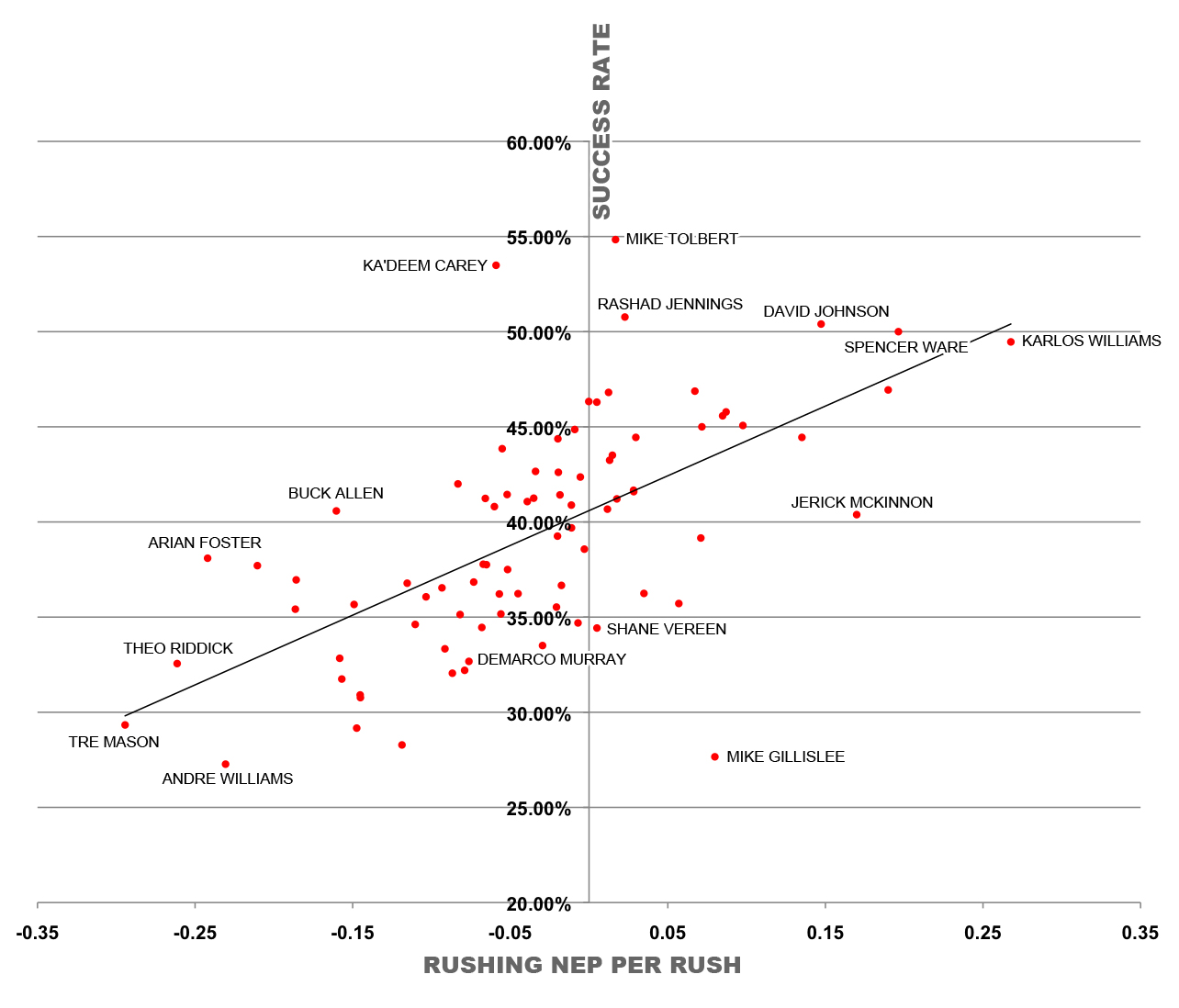
Let's run through an example. Last season, Mike Gillislee had a Rushing NEP per rush of 0.08. (The league average a year ago was -0.03, as rushing is less efficient than passing these days, hence the negative number.) Among all backs with 40 or more carries last season (there were 82 of them), Gillislee ranked 10th in Rushing NEP per rush.
But he also ranked 81st in Success Rate.
In other words, Gillislee had a high per-rush average because he was making some really big plays. Had he been making plays consistently in order to maintain that type of rate, his Success Rate would've been much higher.
Make sense? Cool.
Now, let's take a look at a chart that plots Rushing NEP per rush (x-axis) versus Success Rate (y-axis). Players in the top left of the graph are ones with high Success Rates and low per-carry rates, meaning they're more plodding type backs. In the bottom right, you'll notice Gillislee, as he was more of the big-play runner. The top right consists of the unicorns -- the players who were strong in both metrics -- while the bottom left gathers the players who were nightmares behind their offensive lines.
Surprised? Perhaps a bit.
David Johnson is a monster, having a high Rushing NEP per rush last season (fifth among the group) to go along with a high Success Rate (fourth). This graph also displays why Spencer Ware is an intriguing player entering 2016, and why Karlos Williams is still the smarter backup for Buffalo when he's back from his suspension.
One of the more interesting things to note in this chart is that Andre Williams is in "I didn't have a great season running the ball" territory, while teammate Rashad Jennings is sitting pretty in the "I'm uber-effective toting the rock" area. This is just another reason why Williams may be the worst running back in the NFL.
These numbers can be important, though. I mentioned last season that a high Rushing NEP per rush and a low Success Rate can lead to disappointing seasons -- we saw that with Justin Forsett last year. Fortunately not many high-profile backs fit the mold this year, though.
Regardless, it's a good exercise to go through and visualize.


